University of Colorado Exterior and Interior Signage Standards
as an Addendum to APS 2025: University Brand Identity and Logo Usage
I. Purpose
A. These standards have been developed to assist campus architects, facilities personnel, communicators and sign designers in developing consistent signage on and among the campuses of the University of Colorado while maintaining the unique character found at each. The standards describe the elements of signage so as to communicate the consistent brand message, along with acceptable elements that connote the image of the campus.
B. Definitions
1. Terminology will be used in this document to define specific signage elements and usage.
University logomark, wordmark and signature are defined as follows: The university logomark is the graphic mark, the interlocking CU.
The university wordmark is the verbiage used, i.e. University of Colorado. The university system signature is the logomark with the wordmark, as shown below: The campus signature is the logomark with the wordmark plus the campus name as shown below:


C. Existing Signage
1. Existing signs that do not meet current brand standards shall be grandfathered until a building remodel is undertaken and/or signs are in poor repair and must be replaced. In each case, new signs shall comply with these sign standards.
II. General
A. All words, logos and marks used on campus signage shall conform to the University of Colorado Identity Standards, latest edition.
1. On-campus institutional partners shall adhere to these standards with the exception that they may include their campus signature, in lieu of that of the University of Colorado, within designated districts of operation (as defined by each campus) for Identity (See Section IV) and Building Identification (See Section V) signage conditions. Additionally, off-campus affiliates using university marks should adhere to these standards.
B. Materials and treatment for all signage also shall conform to University of Colorado Signage Standards as published by each campus. See Addendum IV for links specific to each campus.
C. Approvals:
- Campus exterior signage shall be subject to review by university’s Design Review Board as required by APS 3002, Capital Construction Planning and Projects, Appendix 3: https://www.cu.edu/ope/aps/3002
- Use of the university logomark, wordmark or signatures is subject to review by the Brand Identity Standards Committee.
III. Gateway Signage
A. Definition: Gateway signage is defined as elements that comprise a monument-scale definition of a campus boundary, generally located at a major entrance or corner of the campus property that is visually prominent to the community.
B. Scale: Gateway signage is generally scaled for moving vehicular traffic, although may also contain elements that are scaled for pedestrians or bicycles. Refer to USSC (United States Sign Council) for size, height & legibility guidelines: https://usscfoundation.org/wp-content/uploads/2018/03/USSC-Guideline-Sta...
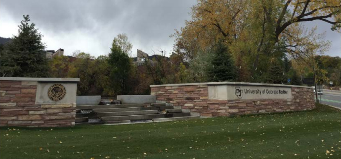
C: Signage Elements: Official entrances and gateways to each campus shall use the interlocking CU logo with the signature for the campus. Where the design of the gateway sign allows, the university seal may be used as a separate visual element from the logo/wordmark.
D. Materials:
- Gateway signage shall be constructed of stone walls, brick walls and other materials consistent with that used in building construction for the campus property on which the gateway sign is to be located.
- Landforms, features and landscaping should be used to enhance the gateway signage and give prominence appropriate to the role of the gateway.
E. Lighting: Gateway signage shall be lighted using ground lighting, back lighting or direct lighting as appropriate for the design of the signage feature and consistent with the LEED / sustainability objectives for the campus.
IV. University Identity Signage
A. Definition: University identity signage is signage used to call individual buildings out from surrounding buildings that are not part of the University of Colorado. Signage is typically located within the top half of a building’s facade. University identity signage shall be limited to no more than two of a building’s facades unless otherwise approved by the Design Review Board.
B. Scale: University identity signage is generally scaled for moving vehicular traffic. Refer to USSC (United States Sign Council) for size, height & legibility Guidelines: https://usscfoundation.org/wp-content/uploads/2018/03/USSC-Guideline-Sta...
C. Signage Elements: University identity signage shall use the signature of the campus it is denoting. Sub-identities for donor-named schools or colleges shall not be used as university identity signage.
D. Materials: Subject to review and approval by the Design Review Board.
E. Lighting: Identity signage shall be illuminated where possible and may use internal lighting consistent with LEED / sustainability objectives for the campus.
Public Private Partnership Signage
The University of Colorado will occasionally engage in public-private partnerships with organizations in which an external organization shares, leases or provides financial support for buildings and their operations that are (or will be) built on campuses or land the university owns. If the external organization leases or provides funding for more than 35 percent of the gross square footage of the facility, it is entitled to exterior building, wayfinding and monument signage in conjunction with CU signage and in keeping with its sign standards. The president and campus chancellors have discretion about specific details around gross square footage and/or funding provided.
In these public-private partnerships, the university shall enter into an MOU with the organization to ensure signs adhere to university sign standards. The MOU would further ensure that the university has the ability to remove the name if the organization does not honor its financial commitments or if the reputation of the organization has a negative impact on the university.
V. Building Identification Signage
A. Definition: Building identification signage consists of signs mounted near building entrances that are generally mounted on pedestal or ground-based enclosures but may be mounted on the face of a building, typically when located within urban campus environments. The purpose of the sign is to announce the name of the building to assist a person seeking the building. Face-mounted building signage should be located at a building’s primary entrance as permitted by campus design guidelines.
B. Scale: Building identification signage should be scaled for pedestrians and bicycle users. Buildings located within urban environments may require signage scaled for vehicular speed-appropriate legibility. Signs can be located further up on a building but must include the university icon.
C. Signage Elements:
- The campus signature may be located at the top 25% of the building identification signage.
- Text of building identification signage shall be in Helvetica Neue Medium or Bold of a size not more than 100% larger than the full mark.
- A sub-text may be included on the sign to identify special status of a building. If included, sub-text shall be limited to 67% of the main text and shall use both upper and lowercase letters.
- Donor-named schools, colleges or buildings shall conform to approved typeface and identity standards within campus design guidelines as approved by the Design Review Board.
- Signage text and graphics should be left justified.
D. Materials – Pedestal or Ground-Based Enclosures:
- Materials that support building identification signage shall be from the vocabulary of materials in the approved design guidelines for each campus.
- Building identification signage shall have a background color that conforms to one of the university color specifications.
- Exception: Background colors that are part of an approved comprehensive signage system shall be limited to the color palette approved for the system.
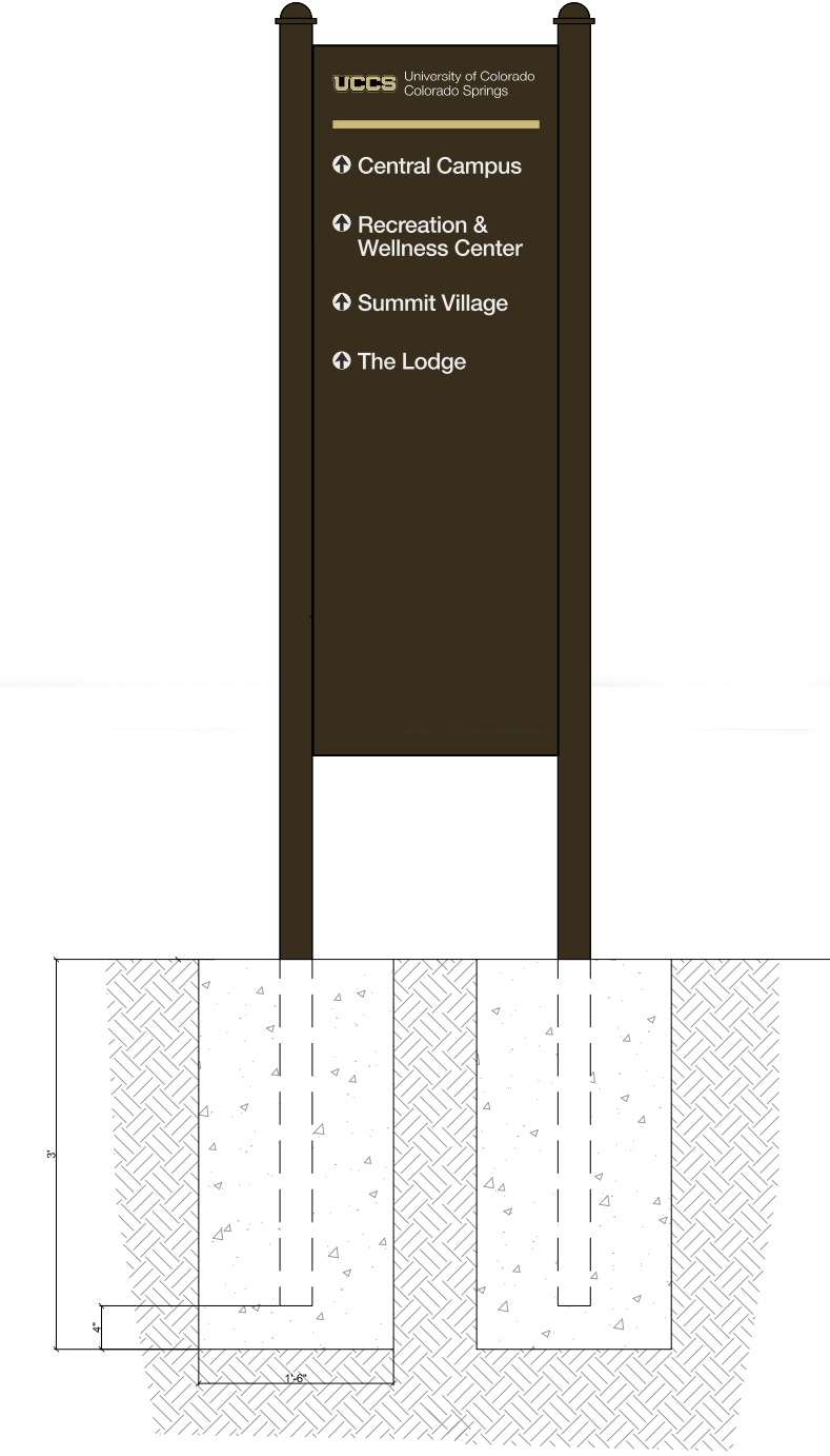
- Exceptions: CU-Boulder shall be allowed a terra cotta background matching the campus vocabulary; UCCS shall be allowed a dark brown background matching the campus vocabulary.
- Open space equal to the height of the text shall be given both above and below the main text, and open space equal to or greater than the height of any sub-text shall be given surrounding the sub-text.
- Where dark background colors are used (terra cotta, black, dark brown or dark grey), the one-color, full mark shall be used with appropriate contrast, following reverse specifications.
E. Materials – Face-Mounted Signage:
- Materials that support face-mounted building identification signage shall be from the vocabulary of materials in the approved design guidelines for each campus.
F. Lighting: Building Identification Signage may be illuminated either internally or by ground-mounted lighting consistent with LEED/sustainability objectives for the campus. Where no lighting is provided, signage should be located near existing street lighting or nearby lighting.
VI. Vehicular Directional Signage
A. Definition: Vehicular directional signage is defined as signage used to direct a person in a vehicle to a parking lot or building that is or is near their likely destination.
B. Scale: Vehicular Directional Signage shall be scaled for moving vehicles at the posted speed limit. Refer to USSC (United States Sign Council) for size, height & legibility guidelines: https://usscfoundation.org/wp-content/uploads/2018/03/USSC-Guideline-Sta...
C. Signage Elements:
- The campus signature shall be located at the top of vehicular directional signage.
- Text of vehicular directional signage shall be in Helvetica Neue Medium or Bold of a size not more than 50% larger than the full mark. 3. Where dark background colors are used (black, dark brown or dark grey), the onecolor, reverse full mark shall be used.
- Approved co-branding graphic logos of campus partnering institutions may be included.
- Campus approved graphic logos for the routing of ambulances, locating of emergency departments, hospitals, parking and delivery may be included along with their associated color palettes. See Addendum III for examples specific to each campus.
D. Materials:
- Materials that support vehicular directional signage shall be from the vocabulary of materials in the approved design guidelines for each campus.
- Directional signage within the public right-of-way shall conform to the U.S. Department of Transportation Federal Highway Administration Manual of Uniform Traffic Control Devices, latest edition.
- Directional signage on university streets shall have a background color that conforms with one of the university color specifications.
- Exception: Background colors that are part of an approved comprehensive signage system shall be limited to the color palette approved for the system.
E. Lighting: Vehicular directional signage shall be lighted or use highway reflective (retroreflective) coatings.
VII. Pedestrian Directional Signage
A. Definition: Pedestrian directional signage consists of directional signage, maps, information kiosks and other elements that direct a person from their point of arrival to their destination.
B. Scale: Pedestrian directional signage is scaled for pedestrians and bicycle users.
C. Signage Elements:
- The campus signature shall be prominently located on all pedestrian directional signage throughout the campus.
- Text of pedestrian directional signage shall be in Helvetica Neue Medium or Bold of a size not more than 50% larger than the full mark.
- Where maps or other graphic devices are used, the logo should be prominently displayed.
- Signage text and graphics are left justified.
D. Materials:
- Materials that support pedestrian directional signage shall be from the vocabulary of materials in the approved design guidelines for each campus.
- Pedestrian directional signage shall have a background color that conforms to one of the university color specifications.
- Exception: Background colors that are part of an approved campus comprehensive signage system shall be limited to the color palette approved for the system.
- Letters identifying pedestrian directional displays (information kiosks, campus directories or maps) may be of raised metallic letters.
- Where dark background colors are used (terra cotta, black or dark grey), the reverse full mark shall be used.
E. Lighting: Pedestrian directional signage should be illuminated (internally or externally) for ease of travel at night.
VIII. Regulatory Signage
A. Definition: Regulatory signage is used to inform the public about what they must or should do (or not do) under a given set of circumstances. Other types may be signs located on streets and in parking areas having to do with parking, signs in public places or signs in architectural facilities prohibiting specific types of activities. They are broadly used to indicate or enforce laws and regulations adopted by the university.
B. Scale: Regulatory signs should be scaled for the primary users, be it vehicular, bicyclist or pedestrian.
C. Signage elements:
- Traffic regulatory signage shall conform to the U.S. Department of Transportation, Federal Highway Administration Manual of Uniform Traffic Control Devices, latest edition.
- Text of non-traffic regulatory signs shall be in Helvetica Neue Medium or Bold.
D. Materials:
- Materials that support regulatory signage shall be from the vocabulary of materials in the approved design guidelines for each campus.
E. Lighting: Regulatory signage should not be lighted. Regulatory signage should use highway reflective (retro-reflective) coatings.
IX. Interior Entrance Lobby Signage
A. Definition: Interior entrance lobby signage is placed at the entrance of a building or to a college, school or department. It is used to establish a first impression of that building, college, school or department. They are generally welcoming in nature rather than informational. The use of interior entrance lobby signage is discretionary and should follow consistent interior signage guidelines.
B. Scale: Interior entrance lobby signage is pedestrian in scale.
C. Signage Elements:
- The wordmark is optional, however the use of the wordmark is preferable.
- Text of interior entrance lobby signage shall be in Helvetica Neue Medium or Bold of a size not more than 100% larger than the full wordmark.
- A sub-text may be included on the sign to identify special status of a building. If included, sub-text shall be limited to 67% of the main text and shall use upper and lowercase letters.
- Signage text and graphics are preferred left-justified.
- Donor-named schools or colleges may use approved typeface and identity standards.
- Institutes with approved co-branding graphics may be used.
- Where other graphics, ornamentation or other visual devices are provided, signage shall be located so as not to compete with the other graphics, ornamentation or other visual devices.
D. Materials:
- Materials used in interior entrance lobby signage should be of any approved material with color properties allowed in the University of Colorado Identity Standards, latest edition.
- Building entrance lobby signage should have a background color that conforms to one of the university color specifications.
- Exception: Background colors that are part of an approved comprehensive signage system shall be limited to the color palette approved for the system.
- Exception: Donor-named schools or colleges and institutes with approved cobranding graphics may use the approved alternatives.
- Exception: Signs with dimensional letters that are attached directly to the wall.
- Open space equal to the height of the text shall be given both above and below the main text, and open space equal to or greater than the height of any sub-text shall be given surrounding the sub-text.
- Where dark background colors are used (black, dark brown or dark grey), the one color, reverse full mark shall be used.
E. Lighting: Interior entrance lobby signage may be lighted.
X. Room Identification Signage
A. Definition: Room identity signage shall comply with CU Brand Standards. Additional optional signage shall be approved by campus brand manager and campus architect.
XI. Building Directories
A. Definition: Building directories are fixed signs that identify the building name and occupants. They are generally located at building entrances and lobbies in a prominent location that is easily accessible. For purposes of this section, electronic directories are excluded.
B. Scale: Building directories are pedestrian in scale.
C. Signage Elements:
- Text of building directories shall be in Helvetica Neue Medium or Bold of a size not more than 75% larger than the full mark. The complete building name shall be given in all uppercase letters at the top of the directory.
- Directory information shall be included on the sign to identify programs offices, or departments as necessary to fully communicate the location of the building occupant.
- Signage text and graphics shall be left justified in three columns or fewer.
- Donor-named schools or colleges may use approved typeface and identity standards.
- Institutes with approved co-branding graphics may use approved alternatives.
- Where other graphics, ornamentation or other visual device are provided, signage shall be located so as not to compete with the other graphics, ornamentation, or other visual device.
D. Materials:
- Materials used in building directories shall be of an approved material with color properties allowed in the University of Colorado Identity Standards, latest edition, and shall match interior building entrance signage, if provided.
- Building directories shall have a background color that conforms to one of the university color specifications.
- Exception: Background colors that are part of an approved comprehensive signage system shall be limited to the color palette approved for the system.
- The proportions of the building directories shall be as required to provide a concise description of the building occupant location.
4. Open space equal to the height of the text shall be given both above and below the main text, and open space equal to or greater than the height of any sub-text shall be given surrounding the sub-text.
5. Where dark background colors are used (black, dark brown or dark grey), the one color, reverse full mark shall be used.
XII. Donor Recognition Interior and Exterior Signage
A. Definition: Donor signage is handled on a campus by campus basis.
B. Each campus shall develop its own process and adhere to the CU Brand Identity Standards, as outlined: http://www.cu.edu/brand
C. See Addendum I for review, approval and suggested steps for development.
XIII. Congratulatory Interior and Exterior Signage
A. Definition: Congratulatory signage is handled on a campus by campus basis.
B. Each campus shall develop its own process and adhere to the CU Brand Identity Standards, as outlined: http://www.cu.edu/brand
C. See Addendum II for review, approval and suggested steps for development.
XIV. Administrative Policy Statement
A. Definition: Each campus will have supplemental guidelines and an approval process.
B. These sign standards are an addendum to the university brand policy statement, http://www.cu.edu/ope/aps/2025
Addendum I
Donor Recognition Interior and Exterior Signage
Donor signage could be handled on a campus by campus basis. Each campus shall develop own process and adhere to the CU Brand Identity Standards, as outlined: https://www.cu.edu/brand.
A. Review and approval of interior donor recognition signage
Since process varies from campus to campus, the following process is recommended to ensure consistency and clarity of how interior donor signage will be handled. Based upon the information provided by each campus, it’s suggested that the following individuals should be involved in the process:
- Involved in developing the recommendation
- Campus architect
- Campus brand manager
- Campus advancement VP and appropriate unit development officer
- Facilities representative, institutional planning or management lead
- Review and approve the recommendation
- Chancellor
- Dean associated with the building project
- Others at campus leadership’s discretion
B. Suggested steps for interior signage development:
- A plan that defines naming opportunities, levels and costs will be first approved by the chancellor and dean associated with the project and then submitted to the campus architect, the building committee responsible for the project and the campus brand manager at the front end of any project that has donor recognition signage involved. (Input and suggestions regarding space preferences for signage that ensure maximum visibility and adequate space given the naming opportunities available could be provided at this time).
- Request that the campus/building architect develop a donor signage plan that includes location, space and placement of donor recognition signage and specifications of size, layout, materials, color, format and costs.
- Review options with the building committee, revise as needed, and approve plan.
- Advancement Officer communicates signage plan specifics to appropriate parties within CUF and CU.
- Advancement Officer serves as the point person for signage requests and is responsible for ensuring accuracy of donor names/levels/signage content.
Important Note: Discussions with donors about recognition possibilities on interior (or exterior) building space should not be started until a recommendation on donor recognition has been developed and approved as stated above.
C. Naming Rights/Sponsorships
Agreements negotiated for naming rights or sponsorships shall follow university building identity standards. Corporate logos shall not be permitted on primary exterior signage on University of Colorado buildings. Signs on donor-named buildings shall conform with university sign standards and shall not be placed on the upper portion of a building, unless that building is in an urban setting and/or is on the periphery of a campus, not the interior.
Addendum II
Congratulatory Interior and Exterior Signage
Congratulatory signage can be handled on a campus by campus basis. Each campus shall develop its own process and adhere to the CU Brand Identity Standards, as outlined: https://www.cu.edu/brand.
A. Review and approval of interior and exterior congratulatory signage Since process varies from campus to campus, the following process is recommended to ensure consistency and clarity of how interior congratulatory signage will be handled.
Based upon the information provided by each campus, it’s suggested that the following individuals should be involved in the process:
- Involved in developing the recommendation
- Campus architect
- Campus brand manager
- Department representative proposing congratulatory signage
- Facilities representative, institutional planning or management lead (will vary by campus)
- Review and approve the recommendation
- Chancellor
- Dean associated with the building project
- Others at campus leadership’s discretion
B. Suggested steps for congratulatory signage development:
- A plan that defines the proposed congratulatory signage including a mock-up of its design, estimated costs and sources of funding will be first approved by the chancellor and dean/VC associated with the project and then submitted to the campus architect, the building committee responsible for the project and the campus brand manager at the front end. (Input and suggestions regarding space preferences for signage that ensure maximum visibility and adequate space given the proposed location and scale of the signage will be provided at this time).
- Review plan with any donors involved, in consultation with the Office of University Advancement, as appropriate, and approve final designs, costs and funding.
- Review the final plan with the building committee, revise as needed, and approve plan.
Addendum III
CU Anschutz Medical Campus - Signage Standards Key CU Anschutz Medical Campus
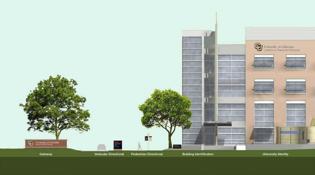
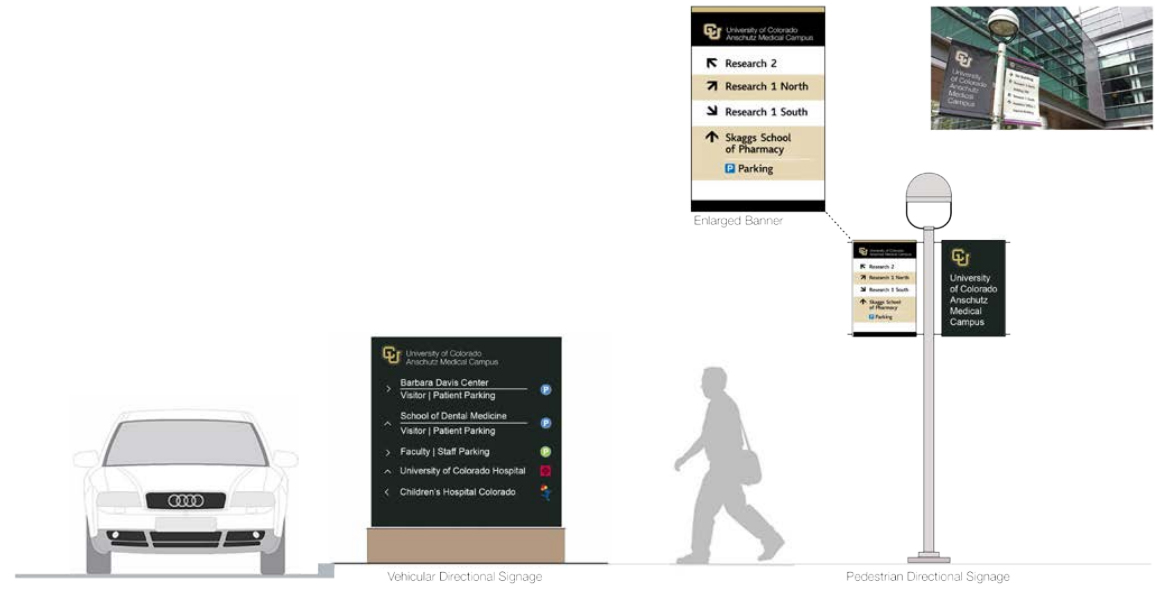
CU Anschutz Medical Campus Vehicular and Pedestrian Directional Signage
UCCS – Building Identification on Canopy

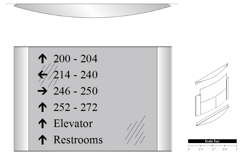
UCCS – Interior Directional Signage
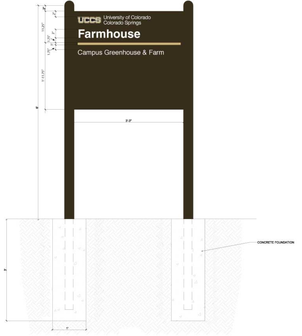
UCCS – Free Standing Building Identification Sign
UCCS – Pedestrian Directional Signage
CU Boulder - Signage Standards
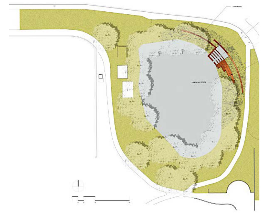
CU Boulder - Gateway Signage

CU Boulder - Building Identification Signage
Addendum IV Campus Sign Standards
-
UCCS
http://www.uccs.edu/Documents/facsrvs/campus%20design%20guidelines%2007.pdf -
CU Denver | Anschutz Medical Campus
http://www.ucdenver.edu/about/departments/FacilitiesManagement/Facilitie...


