

All UIS enterprise and business applications are in service at this time.
Service Status: Green


Color contrast refers to the difference between the brightness of the background color and the foreground color of digital content.
Black text on a white background is very high contrast; light grey text on a white background is very low contrast.
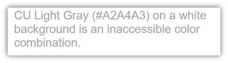
Color contrast is important because people often have difficulty perceiving content when there isn’t sufficient contrast. High-contrast color combinations are easier to distinguish without difficulty and are critical for individuals who have low vision or colorblindness and benefit many others.
The University of Colorado follows the Web Content Accessibility Guidelines (WCAG) for minimum ratios of contrast for small and large text:
Color contrast checker tools can be used to make sure your content has sufficient levels of contrast. Avoid relying on eyesight alone to verify sufficient color contrast, instead use the color contrast checker tool to make sure.
Did You Know? CU Gold and white are an inaccessible color combination due to a 1.9:1 color contrast ratio, which means it should not be used for normal text, large text, or meaningful images. Read about Accessible CU Boulder Color Combinations and visit OIT’s Digital Accessibility Office color contrast webpage to learn more.

Add new comment