Correcting Image Display in Mobile
We've all been there: you design a beautiful email with stunning, engaging graphics that look great in the desktop version of your message. But when you check the mobile version, you find the graphic at the top of your message (often your logo or your showcase image) is shrunken to a fraction of what you intended. Sound familiar?

What actually happens:

What's going on, and how can you fix it?
The problem occurs when content near the top of the message is placed in a content block that Marketing Cloud labels as a header or preheader.
Header
If you're working in a content block that Marketing Cloud labels as a header, you'll be able to tell by hovering over it so that the title of the content block displays in the upper left corner.
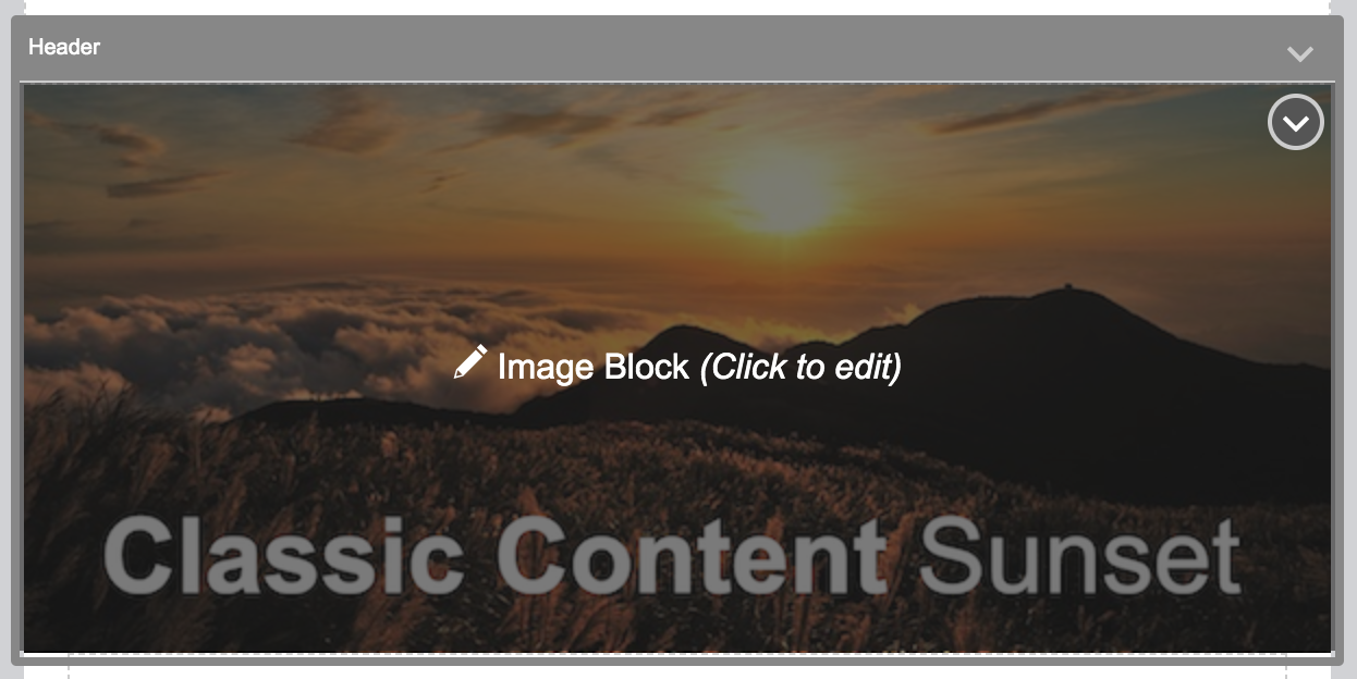
If your content is in a header content block, it will display correctly in the desktop version of your email, but will appear condensed in the mobile version. Because of this inconsistency, we recommend NOT creating content that you expect to display at full size in mobile in a header content block.
Desktop:

Mobile:

Hiding the Header Content Block from the Desktop and Mobile Versions
Marketing Cloud doesn't allow you to delete content blocks, but it will automatically hide the header in the desktop version when you send your message.
Desktop Version: Edit Content

Desktop Version: Preview and Test

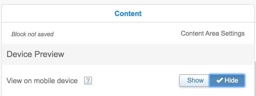
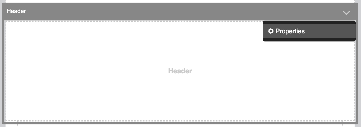
To hide the header content block from the mobile version, select the preheader content block's properties and change "View on Mobile Device" to "Hide." Click done when you are finished.
Header Content Block Properties
View on Mobile Device: Hide

Preheader
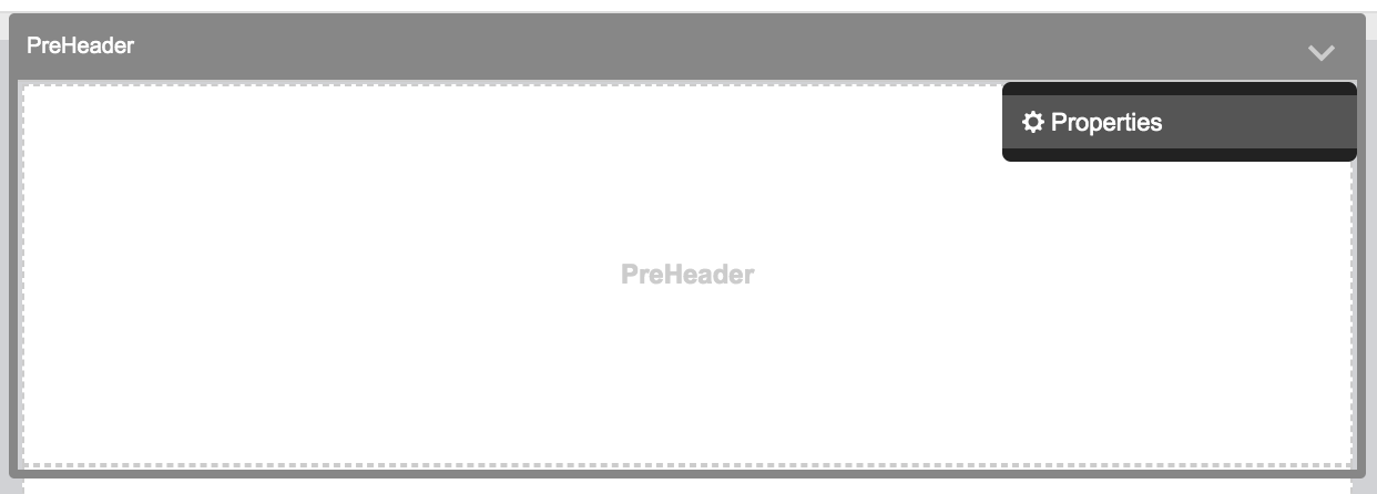
If you're working in a content block that Marketing Cloud labels as a preheader, you'll be able to tell by hovering over it so that the title of the content block displays in the upper left corner.

If your content is in a preheader content block, it will display correctly in the desktop version of your email, but will not appear at all in the mobile version. Because of this inconsistency, we recommend NOT creating content that you expect to display in mobile in a preheader content block.
Desktop:

Mobile:

Hiding the Preheader Content Block from the Desktop Version
Marketing Cloud doesn't allow you to delete content blocks, but it will automatically hide the preheader in the desktop version when you send your message.
Email Studio: Edit Content

Email Studio: Preview and Test

If you're feeling nervous about a blank white space appearing in your mobile version, you can take the extra (but unnecessary) step of hiding the preheader content block in mobile. To do so, select the preheader content block's properties and change "View on Mobile Device" to "Hide." Click done when you are finished.
Preheader Content Block Properties
View on Mobile Device: Hide
