Image Best Practices in Marketing Cloud
Images used in Marketing Cloud emails need to be formatted to a certain size before being uploaded to Marketing Cloud. If you don't, the email might appear fine in Marketing Cloud but when it gets delivered to inboxes, it may be formatted poorly. Recipients of poorly formatted emails are less likely to engage with the content and more likely to unsubscribe.
While the basic rule is to never upload an image wider than 600 pixels wide, the examples below serve as a guide to help you determine what size images are appropriate for your custom-designed email. If you have additional questions, contact your eComm specialist.
- If a large image is uploaded to Marketing Cloud (e.g. 1200 px wide), that's the image size that will display in some recipients' inboxes, forcing them to scroll right to read the content. It will also take twice as long to download.
One Column Layout
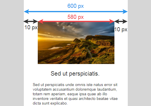
1. If you have one image taking up the entire width of the email, it should be uploaded no wider than 600 px.
- In this example, I have added 10 padding on each side of the image (20 total). 600-20=580 which is what my image should resized to BEFORE uploading it to Marketing Cloud.
Two Column Layout
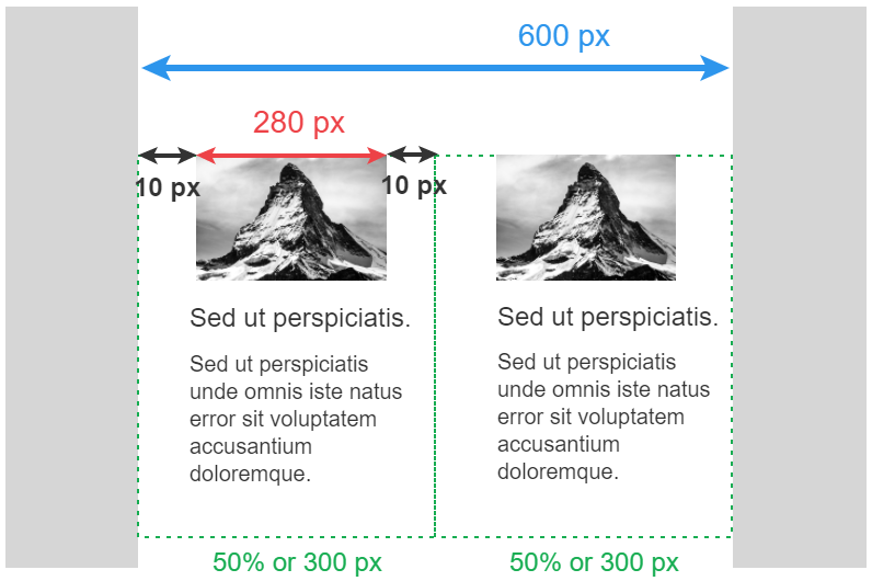
If you have two columns, each with an image, they should be uploaded no wider than 300 px.
- Below, the 2 columns are split 50/50 (or 300 pixels wide). I have added 10 padding on the sides of the image (20 total). 300-20=280 which is what both images should be resized to BEFORE uploading them to Marketing Cloud.
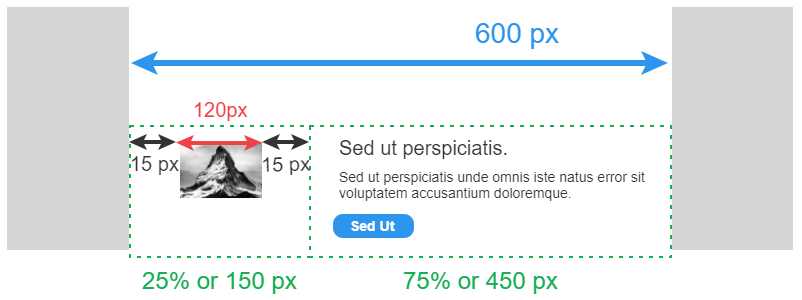
- In this 'newsletter' example, I have added 15 padding on each side of both images (30 total). 600-30=570/2=285 which is what both images should be resized to BEFORE uploading them to Marketing Cloud.
Scale to Fit


Instead, there are two good options:

Or 'Hide' the image content block.

Three Column Layout
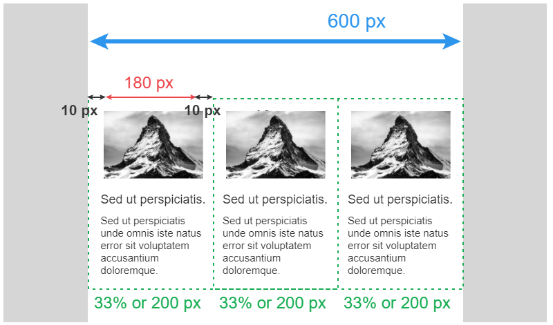
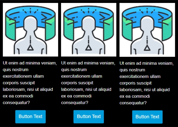
If you have three columns, each with an image, they should be uploaded no wider than 200 px.
- Below, let's look at each individual column (33% of the overall email or 200 pixels wide). I have added 10 padding on each side of the image (20 total). 200-20=180 which is what all three images should be resized to BEFORE uploading them to Marketing Cloud.
Scale to Fit

Instead, there are two good options:

Or 'Hide' the content block

Recorded Session


