Audience Engagement Over Time
Wondering if your audience engagement is increasing or decreasing over time based on the strategies you implement? Find out with Marketing Cloud's report Audience Engagement Over Time. The Audience Engagement Over Time report compares audience participation across a previous time period to determine what groups of constituents are interacting most frequently.
NOTE: This wiki assumes that you've already read Discover Reports in Marketing Cloud and know how to access and modify Discover Reports.
Launching the Audience Engagement Over Time Report
To launch your report, locate the report name Audience Engagement Over Time and click the Create button.

The report will automatically populate using all of the data in your business unit based on the default filters contained within the report logic.
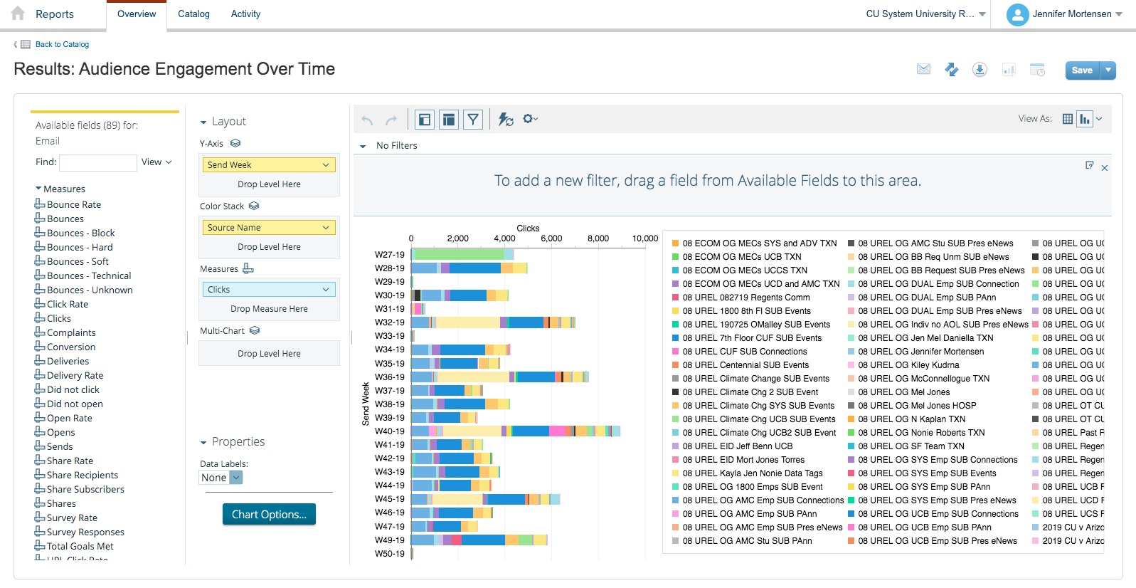
If the information you see when your default report populates is a bit overwhelming, you're not alone. Luckily, Marketing Cloud allows you to filter your report criteria to get more meaningful information about specific email sends.
For the purposes of this example, we will be using the Audience Engagement Over Time report to measure CU Connections opens over time.
Report View
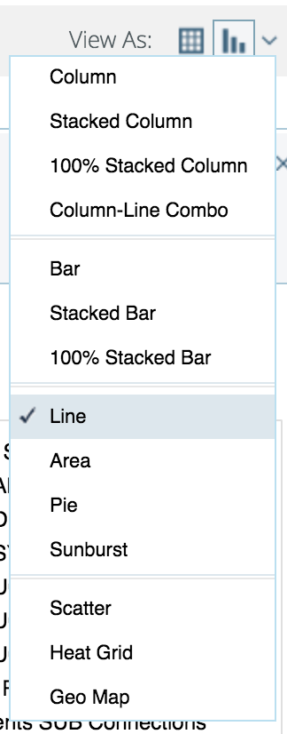
First, select the type of report layout you want to create using the View as Table or Chart options in the upper right corner of the screen. Select Chart and then click the drop down arrow next to the chart icon. Select Line.
Customizing Your Report with Filters
Once your default report populates, you'll be presented with three key areas that allow you to customize the data generated:
- Available Fields: A list of fields you can use to display or filter email send information from your business unit. You can drag and drop available fields into both the layout and filter areas.
- Layout: Options for the X and Y axes and associated measurements that allow you to customize the data your report measures and how it is displayed.
- Filters: Options to specify filter criteria based on traditional filter logic such as "is equal to, "is not equal to," "contains," "does not contain," etc.
Layout
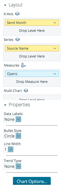
Next, set your layout criteria as follows:
- X-Axis: Drag Send Month from Available Fields and drop in X-axis. Remove other criteria listed by default by clicking the drop down arrow next to them and selecting Remove.
- Series: Drag Source Name (to identify how different send audiences engage) from Available Fields and drop it in Series. Remove other criteria listed by default by clicking the drop down arrow next to them and selecting Remove.
- Measures: Drag Opens from Available Fields and drop in Measures. Remove other criteria listed by default by clicking the drop down arrow next to them and selecting Remove.
Filters
Since the layout options alone don't limit our email sends to a specific set of messages, we can use filters to further narrow our view. We can narrow the pool of email send data that will be included by dragging Email Subject from Available Fields and dropping it in Filters. A window will open that allows you to specify the filter logic. In this case, we will select Match a Specific String and set the logic to contains Connections.
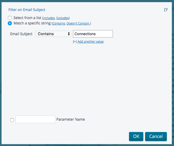
Click OK when you are finished. Your report will automatically refresh.
We also want to include a filter for subject does not contain test, so we will repeat the process above: drag Email Subject from Available Fields and drop it in Filters. When the filter logic box appears, set your filter logic to Match a Specific String - does not contain test.
Click OK when you are finished. Your report will automatically refresh, and your final filter logic results will contain email subject contains Connections and email subject does not contain test.

Your final report will populate based on the criteria you entered and might look something like the screen shot below depending on the number of audiences to which you are sending. You might only have one audience, and that's okay; Connections is just a bit more complicated since it's a System-wide communication.
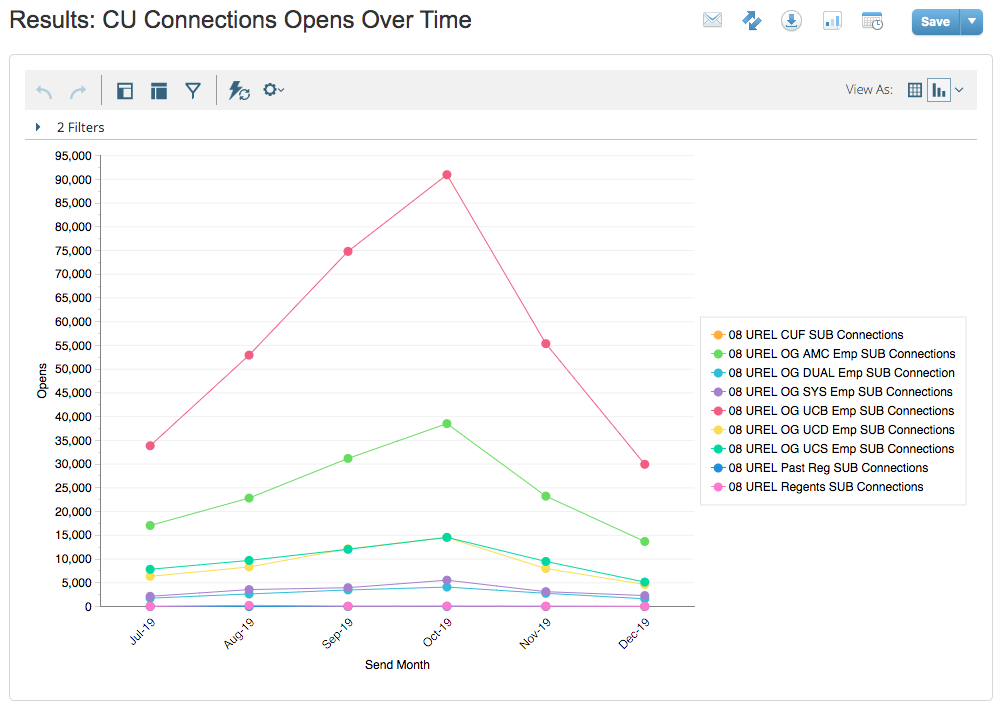
You can then save your report to access it again in the future or schedule updates to run automatically. See Discover Reports in Marketing Cloud for more information.
This report tells us that of the audiences CU Connections is sent to on a weekly basis, employees at CU Boulder are most likely to open the message, followed by employees at CU Anschutz and employees at UCCS. The highest engagement during the six months measured occurred in October.


